Normally I almost always gravitate towards the black and white versions but in both these cases, my eyes just find the color versions more pleasing. I think it has to do with the green grass. Had the grass been a brown hue like it is here right now, I'm sure the black and white versions would have won my eyes over.
Does anyone live in that house/mansion? Is it for sale? I think I could buy something like that and happily spend the rest of my life fixing it back up, assuming I had the necessary funds to do so.
Yes, I will agree with Ed. I like them both, but in your landscape it's almost a waste to do them B&W because the colors are so beautiful. The building itself even offers some nice coloring, especially in the first shot.
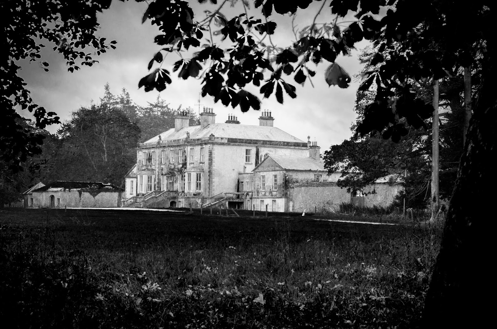
This is Kilkooly House or Kilkooly Abbey. It's derelict for 10 years when the Ponsonby's sold and then the developer went wallop in the crash. Then the bankruptcy agency sold it two years ago and it's up for sale again. Sold for 6 mil in 2008, then sold for 1.2mil and now for sale at 8mil. And whoever buys it will have to pay another few to fix up the house for it has holes in the main roof and the window glass is damaged in places.
I prefer the B&W on the top set and the color on the lower set. For me, the top one just looks run down in the color, whereas the B&W gives it an eerie, spooky appeal. The lower set needs the color to bring out how you've framed it with the foreground. Just my opinion.


Normally I almost always gravitate towards the black and white versions but in both these cases, my eyes just find the color versions more pleasing. I think it has to do with the green grass. Had the grass been a brown hue like it is here right now, I'm sure the black and white versions would have won my eyes over.
ReplyDeleteDoes anyone live in that house/mansion? Is it for sale? I think I could buy something like that and happily spend the rest of my life fixing it back up, assuming I had the necessary funds to do so.
Yes, I will agree with Ed. I like them both, but in your landscape it's almost a waste to do them B&W because the colors are so beautiful. The building itself even offers some nice coloring, especially in the first shot.
ReplyDeleteThis is Kilkooly House or Kilkooly Abbey. It's derelict for 10 years when the Ponsonby's sold and then the developer went wallop in the crash. Then the bankruptcy agency sold it two years ago and it's up for sale again. Sold for 6 mil in 2008, then sold for 1.2mil and now for sale at 8mil. And whoever buys it will have to pay another few to fix up the house for it has holes in the main roof and the window glass is damaged in places.
ReplyDeleteI liked the b&w photos as they give more of a haunting feeling to the old abbey.
ReplyDeleteYep, just a little out of my price range. Let me know when it gets down to a couple hundred grand and I'll move to Ireland and live my dream life out.
ReplyDeleteI prefer the B&W on the top set and the color on the lower set. For me, the top one just looks run down in the color, whereas the B&W gives it an eerie, spooky appeal. The lower set needs the color to bring out how you've framed it with the foreground. Just my opinion.
ReplyDelete